
Article reference KA-02594
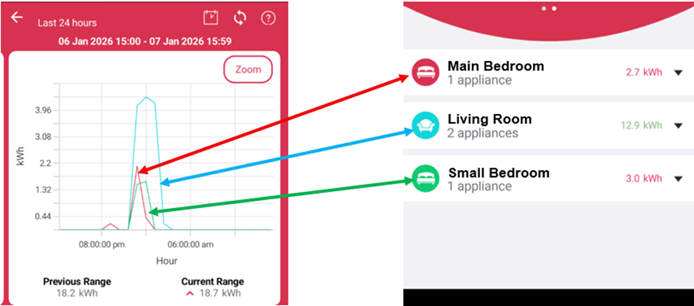
The different coloured lines on the energy usage graph relate to the different zones and will match the symbols accordingly. This allows you to see specific energy usage for each zone.
Applicable models
Dimplex Control App
Related to your product and enquiry. Links open in a new tab.
Article reference KA-02594
The different coloured lines on the energy usage graph relate to the different zones and will match the symbols accordingly. This allows you to see specific energy usage for each zone.
Applicable models
Dimplex Control App
Need more help? Contact our support team
Great, glad that helped. Thanks for letting us know.
Sorry this didn’t solve it. Our support team can take a closer look. We’ll include article KA-02594 so you don’t have to repeat yourself.